Shield
The red St. Andrew's cross at the center of the shield represents faith. The cross splits the shield into four quadrants, representing four different periods in Rhodes College's history. The bent right arm represents Rhodes' Masonic origins beginning in 1848. The owl, a symbol of wisdom, represents the period between 1855 to 1875, when Rhodes was Stewart College. The burning bush, a symbol of God, covers the period between 1875 to 1925, when Rhodes was known as Southwestern Presbyterian University. The lotus flower, a symbol of immortality, represents the college's move to Memphis, Tennessee, and the era of Southwestern at Memphis. In the center of the shield, the book (originally conceived as a Bible) is an all-encompassing representation of Rhodes College's academic mission.
Blackletter
The Gothic-style blackletter is a nod to the beauty and regality of the campus' Collegiate Gothic architecture.
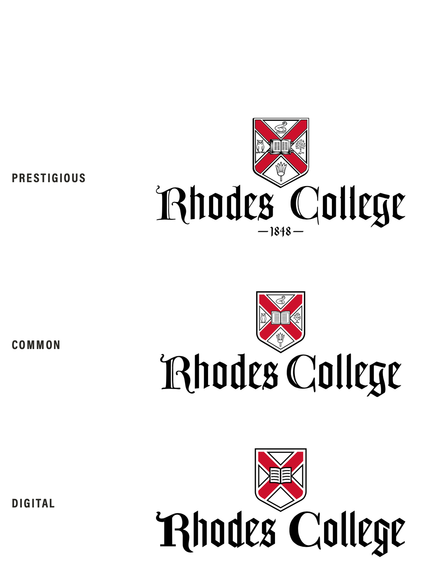
There are three different variations to the Rhodes logo, each with a specific purpose. It is important that the logos be used for their intended purpose only. To easily distinguish between the three at first glance, look at the variation in the two lowercase "l's" in College.
Prestigious
The prestigious logo should only be used for official Rhodes communication documents such as diplomas and official statements from the President. The date within the official Rhodes logo references the college's founding date and emphasizes the pride the college takes in its long history.
Common
The common logo is the most commonly used throughout Rhodes' collateral pieces. It closely resembles the prestigious logo, but with light simplifications and the removal of the date.
Digital
The digital logo should be used where legibility is an issue such as digital advertisements and e-newsletters. An exception would be the website, where use of the common logo is allowed. The digital logo is a heavily simplified version of the prestigious logo. Please send a Communications Request if you need a digital logo.
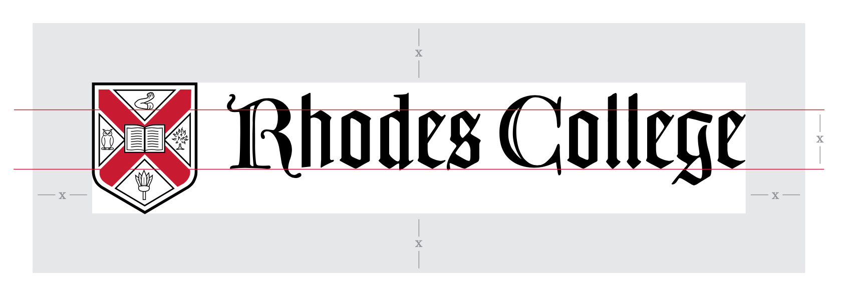
Clear Zone
Clear zone is defined as the area around a logo that no other elements can enter. This space should be kept free of any text or graphics. It is also meant to act as a buffer against the edges of a document. To calculate the clearspace needed for the Rhodes logo at any size, take the x-height of the lowercase letters in the blackletter type. The x-height will be used to determine the clear space around the logo.
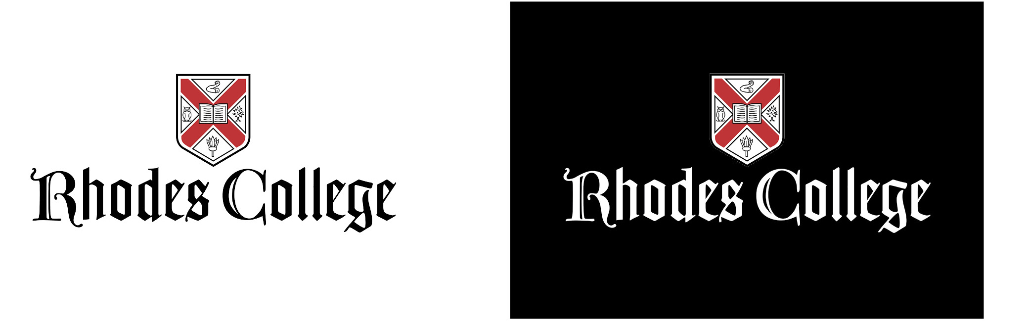
Color variations
All three variations of the Rhodes logo have the same color variants. The common logo is used below to demonstrate the color variants. No other variations in color are permitted.
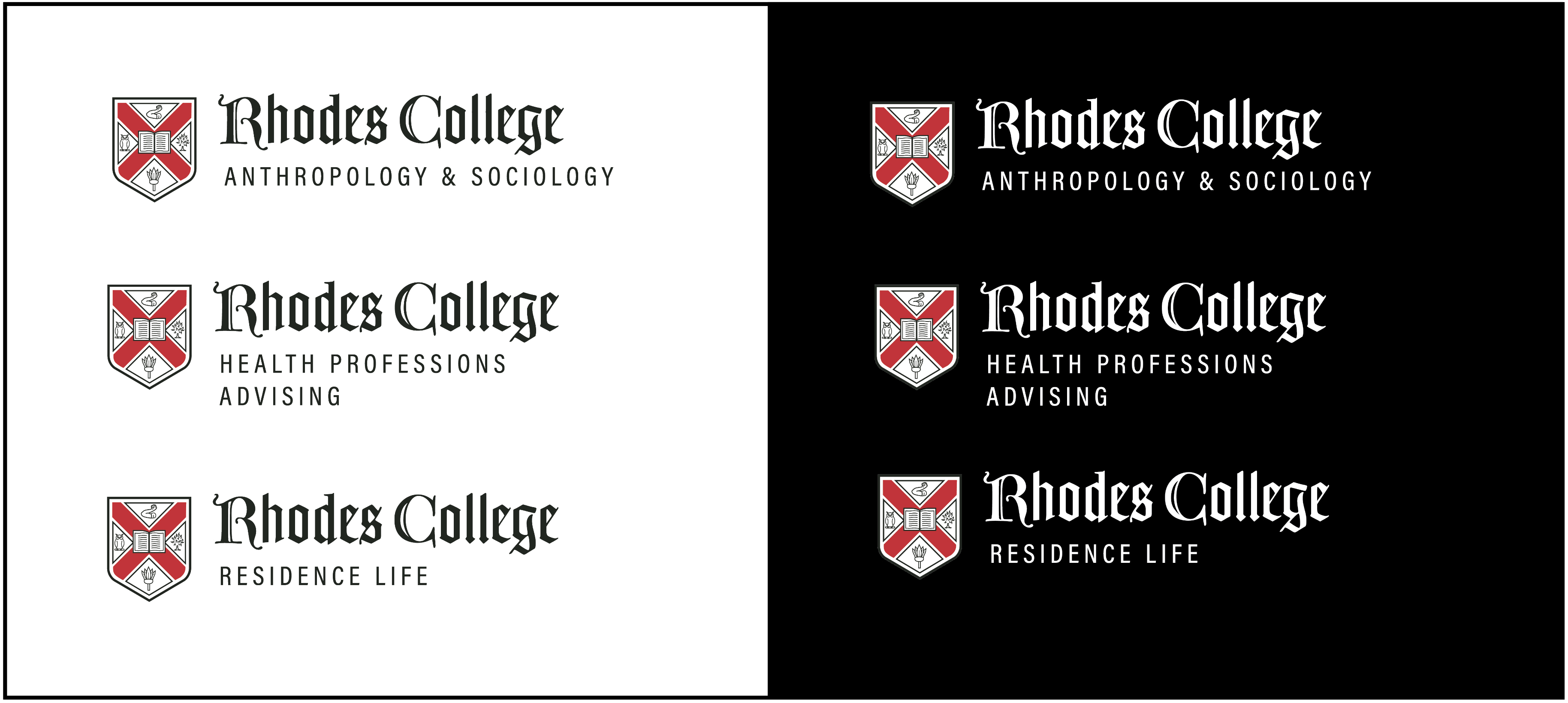
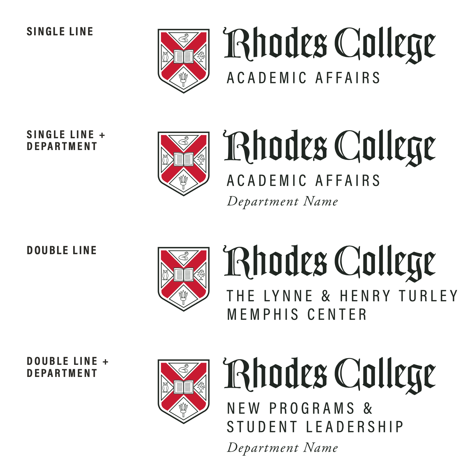
Department LOGOs
Rhodes College has a specific set of logos for a select number of departments. It is imperative that departments not construct their own logos, so as to maintain consistency across the brand. If you feel your department is in need of its own logo, please contact Marketing & Communications to have it made.